Gamma error in picture scaling
Introduction
Examples
Fore-explanation
Explanation
The formulas: gamma and sRGB
Colors
Other kinds of software and output systems
Brightness, contrast and other filters
Consequences
Solutions
Examples
Fore-explanation
Explanation
The formulas: gamma and sRGB
Colors
Other kinds of software and output systems
Brightness, contrast and other filters
Consequences
Solutions
Send a mail to the
authors of your software
Use a correct software
Use the software correctly
Assume a gamma of 2.2
AcknowledgmentsUse a correct software
Use the software correctly
Assume a gamma of 2.2
Introduction
There is/was an error in most photography scaling algorithms. All software tested (August 2007) had the problem: The Gimp, Adobe Photoshop, CinePaint, Nip2, ImageMagick, GQview, Eye of Gnome, Paint and Krita. Also three different operating systems were used: Linux, Mac OS X and Windows. (Software that don't have the problem are listed in the Solutions chapter.)Photographs that have been scaled with these software have been degradated (see the examples). The degradation is often faint but probably most pictures contain at least an array where the degradation is clearly visible. I suppose this happens since the first versions of these software, maybe 20 years ago.
Below, a photograph of His Holiness the Dalai Lama was tuned to exploit the problem. If you want to give it a try, scale it down 50% using your best software. (If you cannot download the image to your computer by right-clicking on it, then either make a snapshot of the screen or download the image in this zipped file.)
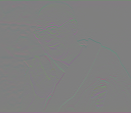
This is what you probably will get once the image is scaled by your software:

How much did you pay for that software? This is a scaling performed by a correct software, which evidently shows the same as the start image:

If you would like to see how your browser scales the image, click here.
To get a smoother image tuned for TFT displays, click here.
If you'd like the routines I wrote to create the Dalai lama pictures: gamma_grayator.tar.gz
When I showed him the examples below, a friend who is a photographer told me he had noticed that error since a long time and lots of his colleagues did. They never could word or understand it. It made them loose a lot of time and caused much frustration. What about the digital age preserving the information? My friend tells me that professional argentic scalings didn't cause such errors. He believes that the problem is mainly due to the fact that the teachers of photographic art in the academies do not understand this technical item. If they did, the main manufacturers of software would have adapted, because there would be a motivated demand. Other people have reported that the gamma caused them serious problems, like a webmaster that was confronted with darkened image thumbnails or a cartoonist who could not get his drawings handled properly. Not only professionals complain. This is a comment from a sensible user: "while drawing on the computer using GIMP and Photoshop, I found that results often look too dark, but I always thought I'm just hallucinating."
Technically speaking, the problem is that "the computations are performed as if the scale of brightnesses was linear while in fact it is a power scale." In mathematical terms: "a gamma of 1.0 is assumed while it is 2.2." Lots of filters, plug-ins and scripts make the same error.
Yet other non-gamma compliant software seem to be Paint.NET, Google Picasa, old versions of IrfanView, Python Imaging Library 1.1.6, ITT IDL 7.0, ImageJ 1.40, XNview/NConvert 1.97.5, Opera, Google Chrome, KolourPaint...
A strange case would be that of ACD Canvas X running on Windows XP SP3: the Dalai Lama picture appeared scaled correctly on the screen but when that image was saved in JPEG format and then re-opened... it was gray.
Some software will produce these results when scaling the Dalai Lama picture:
 |
This was done by MS Paint
in Windows XP. Some web browsers do the same. The image
could also have been green or checkered green and magenta.
In most cases the image will be less blurred than this
one. The explanation is that the scaling is not performed
by computing out an average of nearby pixels, but just by
picking out 1 out of 4 pixels in each 2x2 pixel box. This
is the most simple and fast way to scale a picture but it
often yields obvious problems. It's "downsampling with no
antialias filter". |
 |
This was done by Photoshop
(look closely; slight green lines). Recent versions of
Firefox do the same. The explanation is that the above
technique was used; picking 1 out of 4 pixels, but first
applying an antialiasing filter that blurs the image and
hence makes an average of nearby pixels. That yields the
faint green lines. |
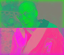 |
This is what SeaMonkey 1.1.17 yields, under ubuntu Linux 9.04. Old versions of Dillo did the same. Version 3.0.4 of Dillo scales pictures correctly, which makes it the only browser I know to do so. (If you would like to see how your browser scales the image click here.) |
On the other hand, there never was a gamma problem within the printing or the movie industry. They have defined tight and scientifically-grounded standards and procedures and they perceive the public software tools as toys. (Note, about this, that some of the tools mentioned here yield incorrect results when they are used bluntly by amateurs, but when used properly by trained technicians they behave perfectly.) The medical and scientific data collecting systems also use precise protocols, yet there may be cases where the analysis is performed on display systems that distort the data. This can prevent a specialist from making an optimal evaluation.
Examples
On the left is a correct scaling of a picture of Saturn (source). the right... Saturn lost its outer ring when the scaling was done using Gimp:

This cute golden little fly (source) lost the silvery hue in its eyes when scaled using Gimp:


The two pictures above were scaled down from a huge size to just a thumbnail, which increases the damage. Also, I had to scale down 20 huge images to get those two where the damage was blatant. It was clearly visible on most of the 20 images, but not as much as on these two.
Below, placed wide apart, are two scalings of a dragonfly (source). This picture was choosen because the difference between the correct and the incorrect scaling is hardly noticeable
 |
 |
But... look at the animation below that continuously swaps between the two pictures. See how more light the correct scaling has. Knowing that difference, even if you wouldn't notice it, do you accept it?

To compare an incorrect and a correct scaling of a photograph of the Kings Creek in the Lassen National Park click here. Look at the window title to know which is the correct scaling (or more simply: the brightest picture is the correct one). (source)
The error appears clearly when scaling a clerid beetle picture. To compare an incorrect 1:4 scaling performed using The Gimp with a correct scaling done using a C++ routine I wrote, you can click here. (source) (the picture canvas was reduced from 1600x1067 to 1600x1064 before scaling)
What about drawings? To see an incorrect and a correct scaling of a detail from "The Pantomimes" by D.H. Friston you can click here. (source)
What about scientific imagery? The radar view of the north polar region of Titan is one of the outstanding feats of the Cassini-Huygens mission. The page www.nasa.gov/mission_pages/cassini/multimedia/pia10008.html shows this view and gives a link to a full resolution picture. To compare the image on the page with a correct scaling of the full resolution picture, click here. (For this picture I compressed the correct scaling to approximately the same file size as the picture on the NASA web page.) (This does not imply that the scientists working on the picture made any mistake. The error was made away from them, when the image was published on the NASA web site.)
What about your holiday photographs? Next example was cropped out of the Extersteine pano. It was scaled 1:4 then scaled back 4:1 as tiles so you can best compare the original with the scaled pictures. To compare click here. You must step back a few meters from the screen, just enough to no more see the difference between the original picture and the correct scaling. Then click back and forth between the original and the incorrect scaling. Maybe ask somebody to click for you. (By clicking on the image you will rotate through the pictures.) If you don't have anybody at hand neither a wireless mouse, to get an automatic switch between the pictures with a delay of 2 seconds, click here, then click on the picture or on the links above to switch between the two comparisons. (source)
A counterexample? This peaceful photograph of Northwestern Afghanistan scales to almost exactly the same picture whatever the software used: click here. (source)
A sideways hint that there is a problem? I scaled 1:64 a picture of a Gibraltar Barbary macaque
 . There are two ways to scale an
image 1:64. Either you scale it directly 1:64 in one step or you
scale it 1:2 six times. The result should be the same... Using my
C++ routine the result indeed is the same. But bluntly using
ImageMagick... To compare the scaled pictures click here. (You can use your own
software to reduce the photograph 1:64 the two ways and compare...)
(source)
. There are two ways to scale an
image 1:64. Either you scale it directly 1:64 in one step or you
scale it 1:2 six times. The result should be the same... Using my
C++ routine the result indeed is the same. But bluntly using
ImageMagick... To compare the scaled pictures click here. (You can use your own
software to reduce the photograph 1:64 the two ways and compare...)
(source)Dithering? These two examples from Sam Hovecar show how standard software mix with the gamma and how the routines written by Sam do it the right way: example 1, example 2.
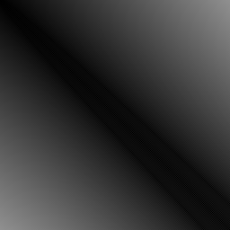
What about simply merging images? Thomas Troeger sent the three pictures below. The first two show a merge between a horizontal and a vertical gradient; (
 +
+  )
/ 2 =
  . The first one shows the
correct merge. The second one was made without linearizing. The
third image shows the difference between the two images, whiter
meaning that the error is worse. If you'd like an animated
comparison between the two merges click here. For the
source code in Python, click here.


Fore-explanation
Almost nobody seems to understand the explanation in the next chapter. So I thought of this analogy to introduce the subject:A military vessel carries 8 types of cannonballs. Each type has a number, from number 1 to number 8:
| Type
|
Description
|
Weight
|
| 1 |
wooden cannonball for
exercices |
1 |
| 2 |
wooden with radio emitter |
1.1 |
| 3 |
wooden, wound in copper |
1.5 |
| 4 |
bare aluminum cannonball |
2.9 |
| 5 |
aluminum, wound in copper |
3.1 |
| 6 |
hollow iron cannonball |
3.7 |
| 7 |
hollow lead cannonball |
6.2 |
| 8 |
lead cannonball |
8 |
By some coincidence, cannonballs of type number 1 have a weight of 1 kilogram. Cannonballs of type 8 have a weight of 8 kilograms. Why not... But this does not apply to the other types. Type 5, for example, has a weight of 3.1 kilograms.
It is very important to account for each cannonball leaving the armory. Especially, it is mandatory to compute the weight of what left the armory. This is vital to keep the ship level!
If one cannonball of type 1 left the armory, together with three cannonballs of type 2 and two cannonballs of type 6, what is the weight that left the armory? You sure will make this computation:
1 x 1 kg + 3 x 1.1 kg + 2 x 3.7 kg = 11.7 kg
One day the ship sank and a military inquiry was conducted. They found the cause of the incorrect estimation of the weight left in the armory. Simply, the officer responsible for the accounting did this computation:
1 x 1 + 3 x 2 + 2 x 6 = 19 "kg"
Explanation
Consider the following test picture: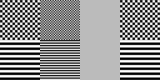
It is made of two rows of four gray squares. Step away from your display to no more see checkers and stripes but just plain gray squares. Or half close your eyes. If you're using a calibrated display system, all eight squares display the same gray. (By "display system" I mean the whole chain: display software -> operating system -> graphic driver -> graphic card -> monitor. If one element of the chain fails, you're done, unless another element of the chain can be tuned to compensate.)
If you are using a common CRT display, the top three checkered squares may show different from the three striped bottom ones (especially the second checkered square). In that case, the striped bottom ones are the reliable ones.
If you are using a low cost TFT display, the third column of two squares may show blueish, with a very different luminosity from the other squares and that luminosity also changes tremendously when you move your head up and down. These are gamma and color problems partially own to LCD technology and partially engineered on purpose to increase the brightness at the behalf of display quality. These gamma problems can partially be coped with by using calibration hardware and/or software. (I use xcalib and that image to get an approximately correct display, reducing the gamma of the blue channel.) (If you need calibration images, better use the ones provided by this web site: www.lagom.nl/lcd-test . They were made for that purpose and the images in this text have a small error.)
This is the test picture reduced 1:2 by my C++ routine:
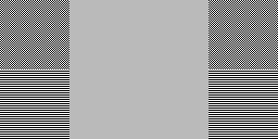
The second column of squares was reduced to the correct shade of gray. The eight squares keep showing the same gray.
This is the same 1:2 reduction yet performed by a current standard software:
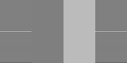
The second column appears much darker. If it does appear the same gray as the first and fourth columns, your system is out of calibration (believe me). It may also be that if you reduce the picture with your own software, the first and fourth columns are no more made of black and white pixels but of shades of gray. One could say that your software made an error but for such things it is also a matter of preferences and choices.
Why did the second column get darker? The problem lies in the gamma. Explanation follows.
It is fair to say that on a common computer system the shades of gray are numbered from 0 to 255. That makes 256 shades. Shade 0 is supposed to be pitch black. Shade 255 is supposed to be the brightest white. All shades of gray are in-between. Shade 1 is just a little brighter than pitch black. Shade 60 is a dark gray. Shade 170 is a middle gray. Shade 230 is a light gray. This table should show those grays:
| 0 |
#### |
| 1 |
#### |
| 60 |
#### |
| 170 |
#### |
| 230 |
#### |
| 255 |
#### |
This picture shows all 256 shades, from 0 up to 255:

255 divided by 2 equals 127. At first thought you would believe that gray number 127 has half the luminosity of gray number 255 (=white). That would be a "linear" scale. Actually, the gray that shows half the luminosity of 255 is gray number 187. This is due to the "power" scale being used.
If you are versed in Physics or Electronics, next table shows the luminosity of some numbers of gray, in a linear scale and in the power scale being used. I made the luminosity range from 0 to 255 to make things more obvious. Then a white pixel and the screen has a luminosity of say 255 µW (microwatts). Whatever... but one thing's for sure: a pixel of gray number 128 has a luminosity of 55.98 µW:
| luminosity scales |
||
| number |
linear scale
|
power scale |
| 0 |
0.0 |
0.000 |
| 32 |
32.0 |
3.683 |
| 64 |
64.0 |
13.074 |
| 96 |
96.0 |
29.827 |
| 128 |
128.0 |
55.044 |
| 160 |
160.0 |
89.641 |
| 187 |
186.0 |
126.718 |
| 192 |
192.0 |
134.414 |
| 224 |
224.0 |
190.078 |
| 255 |
255.0 |
255.000 |
This is the exact same table but with the luminosity expressed in the range 0 to 1:
| luminosity scales |
||
| number |
linear scale
|
power scale |
| 0 |
0.0000 |
0.0000 |
| 32 |
0.1255 |
0.0144 |
| 64 |
0.2510 |
0.0513 |
| 96 |
0.3765 |
0.1170 |
| 128 |
0.5020 |
0.2159 |
| 160 |
0.6275 |
0.3515 |
| 186 |
0.7294 |
0.4969 |
| 192 |
0.7529 |
0.5271 |
| 224 |
0.8784 |
0.7454 |
| 255 |
1.0000 |
1.0000 |
Why such oddness? Why use a power? This clever technical choice was made to best make use of the narrow amount of 256 numbers. Should the scale have been linear, the picture below shows what gray number 1 would have been. It is shown surrounded by gray number 0 (=pitch black). If it doesn't show properly, then your display is inaccurate; on a TFT maybe move your head up and down and on a CRT maybe twiddle with your screen's brightness and contrast to clearly show a brighter central square:

That gray number 1 in a linear scale, already is quite a bright dark gray. But thanks to the power scale, more than 20 shades of gray exist in-between the pitch black and that dark gray shown above. The picture below shows those grays between gray 0 and gray 28:

Conversely, in a linear scale, the shades close to white would all have seem the same; bright white. This would have been a waste. By using the power scale, gray number 254 is significantly dimmer than number 255. The difference is faint, yet useful. Next picture shows six squares with shades 250, 251, 252, 253, 254 and 255. Shade 250 on the left is perceptively dimmer than shade 255 on the right. On a linear display system, you would never have been able to tell the difference between the six shades:
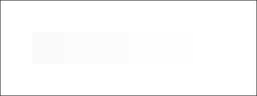
This all, to explain that gray number 127 does not imply a luminosity half that of number 255. Gray number 127 implies that the power of light emitted by the screen must be 21% of the power of bright white. Conversely, the number of the gray that asks for 50% power is 187.
Suppose that a square of 2x2 pixels is made of two pitch black pixels and two bright white pixels. The picture below shows such a square of four pixels magnified 64 times:
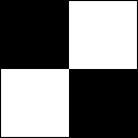
What happens if we reduce the picture 1:2? Those four pixels shrunk to one pixel:
That gray pixel is supposed to have the same brightness as the global result of the former four pixels. Those four pixels being two pitch black and two bright white, the mixture of them yields 50% of the energy of bright white. That is gray number 187.
The error made by many scaling algorithms is that the mean value of the numbers is computed, instead of their luminosity. This yields 127 or 128, which shows 21% light power, which is a gross error. This error is made also when the picture size is increased (I didn't verify this). Whatever the brightness of the pixels being merged or expanded, the error is made and yields more or less drastic damages.
Some pictures, like fuzzy photographs, are almost not degraded by this error. Sharp pictures with tiny contrasted details are quite damaged.
Jonathan Carroll sent this picture with two dithered scales of gray, that allow to test the problem for the whole range of brightnesses. The image needs to be displayed 1:1. The middle scale aligns the shades from number 0 to number 255 in order. The shades in the middle are number 127 and number 128. The two dithered scales are made of only full white and full black pixels. Yet the top scale is made with the correct gamma formula in mind and will ensure that the average brightness is the same as in the middle scale. This means that in the middle of the scale there are not 50% white and 50% black pixels. The bottom scale on the contrary, uses 50% white and 50% black pixels in the middle, which is obviously erroneous. If the image is resized down properly, the top and middle scales will appear identical.
The formulas: gamma and sRGB
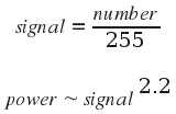
If you are versed in Physics or Mathematics, you now wonder what exact power formula is being used. Well, there are two answers. When I first wrote this text, I used the simplified gamma formula shown below, where 2.2 is the gamma. signal and power range from 0 to 1:
Actually, the formula that's being used for common picture encoding and decoding by quality software is the one below. It defines the "sRGB colorspace":

The graph below shows the result of the exact sRGB formula in red and underneath the result of the simple gamma formula in green:
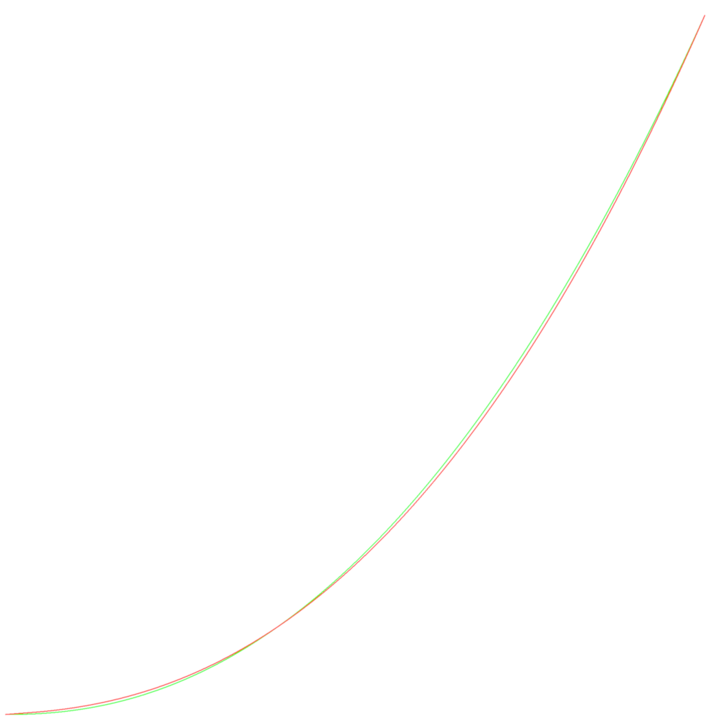
Don't be fooled by the fact that the curves seem almost identical. Gray number 1 is 60 times brighter by sRGB than by the simple gamma curve. Gray number 8 is 5 times brighter. This will not make any noticeable difference in most cases but it can, for example when a very dark picture is handled.
Below are the formulas and their reciprocals in Python. The last lines of the script produce the data for the second table in previous chapter:
#! /usr/bin/python

from math import *

def sRGB_to_linear (s) :
   a = 0.055
   if s <= 0.04045 :
      return s / 12.92
   else :
      return ( (s+a) / (1+a) ) ** 2.4

def linear_to_sRGB (s) :
   a = 0.055
   if s <= 0.0031308 :
      return 12.92 * s
   else :
      return (1+a) * s**(1/2.4) - a

def gamma_to_linear (s) :
   return s ** 2.2

def linear_to_gamma (s) :
   return s ** (1/2.2)


for x in (0, 32, 64, 96, 128, 160, 187, 192, 224, 255) :
   s = x / 255.0
   print x, s, sRGB_to_linear (s)
Colors
What about colors? Common color pictures are made of three primary colors: red, green and blue. Each pixel is usually made of three numbers:- A quantity of red, between 0 and 255.
- A quantity of green, between 0 and 255.
- A quantity of blue, between 0 and 255.
Those three quantities of primary colors use the exact same power scale as explained above for grays. Hence colored checkers or stripes undergo the same degradation by lots of scaling software. It's not just a matter of brightness, like for the grays. If an array of a picture tends to be made of fine details in one primary color and flat in another primary color, the color of the details and the overall color of the array will change drastically.
The test pictures that follow are best viewed with a CRT display or a quality TFT. Low-cost or laptop TFT displays will show nonsensical colors unless you calibrate them an look at them from a perfectly perpendicular angle.
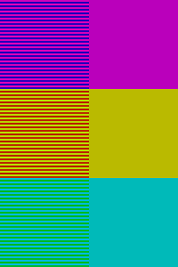
The picture below shows six colored squares. The left and the right squares on a same row should look the same on your display (if you step back or half close your eyes). At least they should have a quite close color. If you have a TFT display, move your head up and down and find the position in-between where the colors match best:
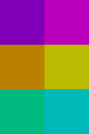
Now this is the result of reducing that picture 1:2 with a correct algorithm and with a common current software. Guess which one is the good one:

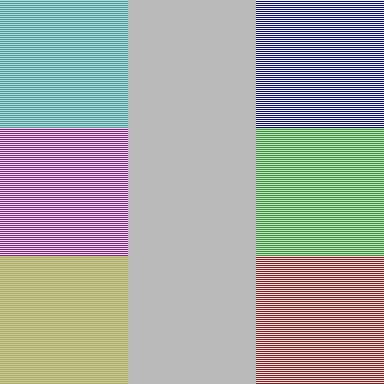
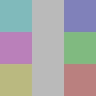
The next test picture is made of 3x3 gray squares. The central column is made of uniform 50% luminosity gray pixels (gray number 186). The six squares on the sides are made of stripes of colors, whose overal result is meant to show the same 50% luminosity gray. Most probably, on your screen the six squares will display a faint coloration. The more accurate your display system, the less colored the squares appear. If you have a laptop TFT display like mine, just tilt it or move your head up and down to see strong colors. At mid-course the squares should be close to gray (the colors are complementary: if you move one direction, the bottom left square gets yellow, the other direction it shows blue; in-between it is close to gray):
Reduced 1:2:

I spent two hours tuning the next one but I just love the result. If you are using a TFT display and the big test picture shows like the incorrectly scaled one down right, move your head downwards. The better the position of your head, the more the big test picture should look like a flat gray strip (like its correctly scaled copy, down left):


Next example performs no scaling, rather it converts a color image to a grayscale image. So to say, it displays a color movie on a black and white TV. The square below is supposed to show evenly gray. Two little squares in the center are meant to show the same gray as the rest but they do that by mixing color pixels of green and magenta (
 and
and  ). The
top left square is meant for quality TFT displays while the bottom
right one is for CRT displays. (Move you head up and down if you
have a standard TFT display and the little squares look too bright
or too dark.) So, it looks gray but it is a color picture because it
contains strongly colored pixels:
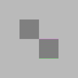
Let's convert that picture to grayscale. Below is what my software yields. The two little squares formerly made of colors can be distinguished if you look closely but the overall result is that the whole picture stayed in the same gray, which is the logical and desirable outcome:

This is a conversion to grayscale made by a standard current software:

Brightness, contrast and other
filters
At first I thought the brightness and contrast filters too made the
gamma error. Then I learned and realized those filters are quite
loose in essence. Their principle dates from a time when their
electronic counterpart in the early television sets played directly
with the gamma curve. What is currently being called "brightness" or
"contrast" can be almost anything, so it's difficult to pretend one
implementation has the gamma wrong, since the implementation as a
whole can be seen as wrong.Brightness
In The Gimp, the brightness tuning is a simple algorithm that tries to preserve the picture. It has nothing in common with the brightness tuning of television sets. It has no physical justification either. It just is a choice that does increase the overall brightness and pleases the eye. Its principle is very simple: say the brightness is increased and gray 0 becomes gray 40. Gray 255 will stay gray 255. All grays in-between will increase a value in-between 0 and 40. Gray 128 will increase of 20...In CinePaint the brightness tuning adheres to the system used in televisions. It adds the same value to the numbers of every shade of gray. Say 0 becomes 40, then 30 becomes 70, 200 becomes 240... just add 40 to all. That seemed heretic and oversimplified to me but actually this *is* the way television sets behave, for the same reason of electronic simplicity. Yet there is a problem for color images. CinePaint bends the colors to achieve an illusion of high brightness. Indeed a television set can bring the brightness to its extreme and maintain the colors. CinePaint, on the contrary, is limitated by the fact that each primary color channel has a maximum of 255. To increase the brightness when one primary channel already is at 255, they choose to increase the other channels. To prevent there be a visible transition when one color reaches 255, the trick begins already before... Again, this simply is a choice, that meets needs. Improvements in image encoding will allow to avoid such tricks.
A first problem I have with these brightness tunings is they depend on the gamma being used. They won't give the same result on a picture with a gamma of 1.8 and a picture with a gamma of 2.2.
A second problem is those algorithms are all different. It is not sane that the brightness filter in different software behave a quiet different way.
The brightness filter in The Gimp has the disadvantage to be unreversible by itself. You cannot reverse the effect of an increase in brightness by a decrease.
I have no direct objections against those filters. Simply I believe they should each get a distinct name. The way they operate should be explained clearly. For example almost nobody knows what their parameter means. And they should be available altogether on every software, with their proper names.
A more "absolute" set of brightness and contrast filters should be formulated, independent from the gamma and with simple and meaningful physical interpretations. I wrote two different "brightness" filters that have these particularities and have some advantages when used. For example they better reveal details in photographs.
The way images are encoded must also be changed, to allow more liberty and security when using filters. For example I converted a photograph to 32-bit float encoding in CinePaint, then put it to maximum brightness, then reversed again to normal brightness. The picture was deeply damaged. This is logical but insane. Using an adequate high-precision encoding, I should have returned to the exact same image.
Contrast
In CinePaint, the contrast filter does follow the principle of the television set contrast. But just the principle. A big difference is a television set multiplies the signal starting from the black point. Say you double the contrast, then gray number 0 stays 0, 1 becomes 2, 7 becomes 14 and so on. CinePaint applies the same multiplication but using gray number 127 as a hallucinatory black point. So, 127 stays 127, 128 becomes 129, 134 becomes 141... and 126 becomes 125, 120 becomes 113. This is a choice that makes sense for digital photography. Except for the fact that the "black point number" should have been configurable by the user. And please explain to me why I had to type a contrast factor of 0.5 to get a multiplication of about 2. This all was observed using a grayscale picture, I don't know yet how colors are handled.Gamma and Exposure
In CinePaint, the gamma filter is correct (tested on a grayscale image). I was just puzzled by the fact that it actually computes the inverse of the gamma you type in... To apply a gamma of 2.2 I had to type 0.4545... But the exposure filter, available in the same dialog window, makes the error. The principle of the exposure filter is "what if the photographer had exposed the camera sensor say two times longer?" You get a brighter picture... In CinePaint, gray number 0 stays 0, gray number 64 becomes 128 and gray number 128 becomes 255. As if it was a linear scale... Incorrect... Yet... this is the exact implementation of a television set contrast filter! Everything is mixed up... And by the way, why do I have to type an exposure filter parameter of 1 to get an exposure (incorrectly) multiplied by 2?Others
Numerous other filters sure make the error too. For example, below the picture of the Dalai Lama was simply blurred a little bit (Gaussian blur, radius 2). Non-gamma compliant left, gamma compliant right: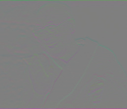

Other kinds of software and output systems
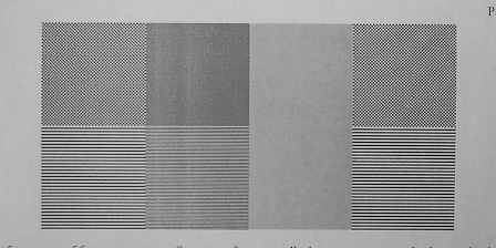
Vector drawing software like OpenOffice Draw and Inkscape propose a "50%" gray. You guessed correctly: it's gray number 127 (128 actually). In this case the problem is less important. The shades are displayed and you choose the one that suits your feelings. Anyway I bet the developers thought that 50% gray has 50% luminosity. Bitmap scaling and gradient algorithms used by these software surely make the gamma error too.While printing this page on a B&W laser printer I got this for the first test picture. I'l try to make a more reliable photo or scan, anyway it's obvious that there are serious problems. I think the gamma was computed correctly. The problems arise from a fact symmetrical to the problem caused by CRT displays. On a CRT, white pixels will bleed laterally. On this sheet of paper, the black laser printer ink dots bleeded in all directions. That's why the finely checkered square got very dark (symmetrically, it gets very bright on a CRT). Anyway this should have been compensated in the printer driver (just like the electronics of CRT displays should do, by the way):
A friend told me that the PhotoPrint software makes error with the gamma. It doesn't print the test images of this text correctly.
Consequences
I tried to see how big Web sites handle their pictures. On Wikipedia, for example, an image is nearly always available in its original size and as a thumbnail. Obviously the scaling is done using the incorrect algorithm...I tried to verify how museums scale the pictures shown on their web sites. One Guggenheim museum uses an algorithm that confers a kind of "plastic" look to the scaled pictures. The pictures are encoded in high quality but since they are transformed to get that "nice" plastic look I cannot compare. The Musée du Louvre uses a standard scaling algorithm, which makes the error. But the pictures are encoded in low quality JPEG, which makes even more damage than the gamma error. A friend who is in the business laughed at me and reminded me that museums simply don't care to provide correct reproductions. Only some specialized enterprises make an activity of using high technology to manufacture reliable reproductions.
I tried to do the same on the NASA sites. Actually I could not compare the pictures correctly because the thumbnails inside the text pages seem to be made using very coarse graphical tools. The errors are much more important than the one I'm studying. Now then, those thumbnails don't pretend to have any scientific exactness and they are correct representations of what they link to. So I went testing the big scientific images that the NASA makes available to the public through its servers. Most often the pictures are available in two or more scales. All scaled versions I tested had the problem... Those scaled pictures were never meant to be used in accurate scientific studies and for lots of them the degradation is hardly visible. Besides, the original big picture is always proposed and it is also available in high quality TIFF format... If you need quality, you get it. Anyway I felt a little bit sorry.
What about your pictures? Did you store your family photographs in their original files or did you scale them, did you tune something and threw the original away? How many amateur astronomers rely on inaccurate software to handle their photographs?
Solutions
Send a mail to the authors of your software
Tell them you require a proper handling of the colorspace.Use a correct software
Some feedback indicated that Mac OS X 10.6 is now sRGB-compliant as a whole. Its image processing system library appeared to be correct, for example using the Core Image Fun House app. The idea behind seems to be that *any* software running under Mac OS X 10.6, for example Pixelmator, will handle the images properly, simply because Mac OS X will handle them properly for them. (This requires that the software makes use of the system library... For example, the sips command in Mac OS X 10.6 still does not scale correctly, which implies that it scales the image by its own (incorrectly).) Yet other feedback showed that Mac OS X has not become compliant... I was not able to sort this out. Be cautious...The following software have been reported to linearize the images correctly before operating on them. Some were gamma-compliant since a long time before I wrote this text, some were enhanced after their authors read it... Keep in mind that this list is not rock-solid. For example, one software may have been reported as correct because it was used on Mac OS X 10.6. So if you're using a previous version of Mac OS X... Also, some software have been reported as correct because it was *possible* to perform correct operations on the images. Yet blunt operations on images will yield incorrect results... Some software will show incorrect scaled previews but the final image will be correct anyway... Some software will do everything correctly if you make simple tests with them, but, when you start working and for example cut & paste images from other software, the operation on those images can still be incorrect... (without you being able to tell which of the two software is reponsible...)
- IrfanView from version 4.37.
- The Netpbm
toolkit for graphic manipulations, provided you use the pamscale command and you
don't use the -filter option.
- The latest version of Image Analyzer
handles the image gamma correctly in some of the common
functions: scaling, rotation, smoothing, inverting and grayscale
conversion. The gamma can be set by the user but default is 2.2.
- The image exporters in Aperture 1.5.6 (but
Aperture 3.0 won't scale images down correctly).
- Rendera, fromout
version 1.5.6 at least (the previews are computed incorrectly).
- Adobe
Lightroom 1.4.1.
- The Preview
app in Mac OS X starting from version 10.6.
- The Acorn app
for Mac OS X, if the
Lanczos scaling algorithm is used.
- Adobe
Photoshop Lightroom 2 and 3.
- Quark XPress 7.0 and 8.0.
- The Links browser
in graphical mode (since 2001...). Snapshot here: www.xaver.me/drdoswiki/uploads/Main/li213gam.png
- Tux paint (this is a great
drawing software for kids, not a photo processing software).
- It seems GEGL handles images
in 32 bit linear format, which is the ideal solution. It is not
yet readily available to end users.
- cPicture
(minute in size, huge in functionalities).
- GraphicConverter (starting from version 6.6.2b35; beta
available here: www.lemkesoft.org/beta.html
, release planned for March 15 ).
- Bibble, at least version 5.
- The current alpha version of RawTherapee but only
when using the "Downscale" scaler.
- The ImageWorsener free command line tool.
- SAR Image Processor from www.general-cathexis.com .
- TinyPNG from www.tinypng.com
.
These software would be called "realy nice" because they allow you to load an image, scale it and store it back, without having to fuss about colorspace, gamma or encoding. Some of such software will translate the image in a huge 16 bit or 32 bit depth image in RAM... some others will keep the image in 8 bit, which requires much less RAM, but they will decode it to 16 or 32 bit linear on the fly when the scaling is done, and store it back encoded in 8 bit, which requires more processor power...
- NUKE was designed from the ground up to work in linear space using 32 bit floating point.
Use the software correctly
Some software allow you get a proper gamma-handling if you ask for it. In some cases, the software is quite expensive and intended for common photographs. Then the fact that the images are handled incorrectly by default is a shame. In other cases, the software was always intended to be used by trained professionals. Then, well... you have to know the tools of your trade...Such software are:
- Photoshop
CS3 and CS4.
- Nip2.
- Corel Photo Paint X4 (and maybe CorelDraw).
The key is that you first need to convert the image in one of these encodings (you should find this easily in the software's menus):
- 16 bit depth linear encoding per color channel. (Some
specialists state that 16 bit is not enough and that you may get
artifacts but I never had problems when just using 16 bit
depth.)
- 32 bit depth linear encoding per color channel.
- A floating point linear encoding.
- A linear color space, like XYZ (which implies 32 bit depth).
Provided the image is now expressed in linear scale encoding with enough depth, every computation on the image will be correct.
Later on, you can convert the image back to sRGB. (This is automatic if you save the image say in JPEG format.)
These software would be called "nice" because they automatically decode to a linear scale once you ask for 16 or 32 bit depth. But you have to ask them to use 16 or 32 bit depth...
One drawback with Photoshop is that some tools are not yet available for 32 bit encoded images, like bicubic resampling. The procedure below is more complicated but it should allow to work around. The only downside would be some rounding errors (probably not visible) as a result of converting to a linear gamma and back again:
- Convert to 16 bit/channel mode to minimize rounding errors (optional).
- Go to "Convert to profile" (in CS3, this is under the Edit menu).
- Select the current profile for the destination space (so that both the source and destination space are referencing the same color space) *but do not hit OK*. If your document is not yet color managed, sRGB is probably the safest guess. This will pre-populate most of the fields for the next step...
- Select "Custom RGB" for the destination space. You will get a pop-up window asking for the parameters for your custom color space.
- In the options for setting up a custom color space, leave everything unchanged except set the gamma to 1.0.
- Press OK in the Custom RGB dialog box and then press OK on the Convert to Profile dialog box.
- Resize as normal.
- Convert to your previous color space.
- If you converted to 16bit/channel mode, you may want to convert back to 8bit/channel at this point.
Assume a gamma of 2.2
The idea is simple: impose a gamma of 0.454545, work on the image, then impose back a gamma of 2.2.But:
- This is an approximation. Imposing a gamma of 0.454545 is
quite close to making an sRGB-encoded image linear. This will do
in most cases... It should be perfect for photographs. But keep
in mind that it is not technically perfectly correct. If you're
working for the industry or on scientific data, you may get
reproaches.
- While you work on the image, if it is displayed, it will be
displayed incorrectly; much darker. As a photographer, if you
have to make fine tunings, you sure don't want to work that way.
(In the VFX industry, the images are kept in linear encoding
throughout the processes. Hence the software need no include the
gamma in their computations. As the displays use gamma encoding,
a LUT is used so the images are displayed correctly.)
- For this method to give proper results, the image must first
be converted to say 16 bit depth. Almost every software can
impose a gamma of 0.454545 to an image and then back a gamma of
2.2. But, if this is done using a depth of 8 bit per channel,
the image will simply be massacred. It may survive if it is only
made of bright colors. Yet if the image has dark arrays, they
will be smashed. The dark image below can be used to check if a
software or procedure keeps the data encoded in 8 bit depth when
it is linear. The scaling on the left was performed correctly,
using at least 16 bit depth. On the right, an example of
"massacre" when 8 bit depth linear encoding is used. (If you
just see black squares, tilt your head or tune your display.)
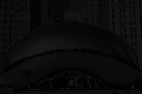

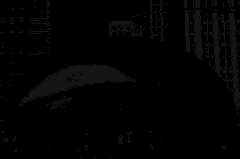
These software are "not nice", because you have to perform all operations: convert to 16 or 32 bit depth, ask for a gamma of 0.454545, then at the end convert back to a gamma of 2.2... and the whole is not technically exact... Anyway it does the job.
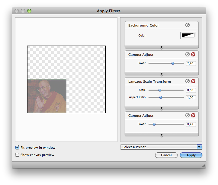
This nice snapshot shows the chain of operations in the Acorn app (using a version of Mac OS X before Mac OS X 10.6). Be careful: the chain shows that a gamma of 2.2 was applied before scaling. Actually, what Acorn understands by this, is that the gamma must be *decoded from* 2.2, which means that a gamma of 1 / 2.2 was applied, which is 0.454545. Conversely, at the end, when a gamma of 0.45 is applied, Acorn in fact applies a gamma of 1/0.45 = 2.2:
Now let's see how this works or may work with ImageMagick, Gimp-Gluas, CinePaint, PHP...
ImageMagick
First of all a warning: ImageMagick is regularly being enhanced and transformed. What you read here is how things worked for me when I made tests with ImageMagick. Read it to get some understanding of the general ideas. But it may not work on the version of ImageMagick you are using. You may have to adapt.The ImageMagick library allows to convert images to 16bit format and to change the gamma. This command performs the whole chain of operations to resize an image named in.png to an image named out.png. The image is scaled down to 50%:
convert in.png -depth 16 -gamma 0.454545 -resize 50% -gamma 2.2 -depth
8 out.png
You can replace the "-resize 50%" with any set of operations on the image that you want to be performed correctly.
I'm assuming that the image in file in.png is encoded in 8 bit depth and that I want out.png to be 8 bit too. If in.png is already encoded in 16 bit, then -depth 16 is useless. And if you want out.png to be encoded in 16 bit, then of course don't use -depth 8 at the end.
Just for your information & skills, this is how I scale an image towards JPEG. The Lanczos filter is the sole one that's mathematically perfect (actually that would be the Sinc filter but Lanczos is a practical implementation of it). For example, if you scale up an image and then back to its original size, several times, only Lanczos and Sinc will keep the image identical. The -depth 8 parameter at the end was omitted because JPEG implies 8 bit depth. To end with, a quality factor of 95 and a sampling factor of 1x1 allow for an almost exact image with no color bleeding.
convert in.any -depth 16 -gamma
0.454545 -filter
lanczos
-resize 50% -gamma 2.2 -quality 95 -sampling-factor
1x1 out.jpg
A few notes:
- On the version of ImageMagick I'm currently using, there is no
need to specify -depth
16 either. It seems to be implied.
- -scale (instead of -resize) will operate properly on some
versions of ImageMagick. On other versions, only -resize will
use the proper filter. Indeed -scale implies an older algorithm
that does not take the -filter parameter into account. Best
always use -resize unless you have a mandatory reason to use
-scale.
- This problem was reported: "on a 256-color grayscale image, I
found that the process inevitably reduced it to a 255-color
image: color 1,1,1 dropped, becoming 0,0,0. That is a
potentially significant loss, and one that those working on such
images should probably be made aware of."
- Convert the image to 16 bit format and linear scale with this
command. It produces an image named temp1.ppm. The PPM format is
used because it allows 16 bits per color channel:
convert test.jpg -depth 16 -gamma 0.454545
temp1.ppm
- Edit this image temp1.ppm with a software that can operate on
16 bit images, like CinePaint. Possibly combine it with other
images you converted the same way to 16 bits and linear scale.
Of course, one such software that you can use is the command
"convert" itself. It has many possibilities. See its
documentation.
- Save the temporary results of your work in files named say temp2.ppm, temp3.ppm... Still being in 16 bits and linear encoding.
- Once you have the final image, named say temp7.ppm, and you
want to convert it to a compressed and standard format to send
it away, use this command:
convert temp7.ppm -gamma 2.2 result.png
In the example above I converted back to PNG format because it is a reliable compressed format. If you wish to convert to JPEG you should better specify the quality you desire. A quality of 85 is just fine in most cases. A quality of 65 is really poor. If you need the image to be nearly exact then you must use a quality factor of 95 or maybe 100:
convert temp7.ppm -gamma 2.2 -quality
85 result.jpg
If you are working on images with contrasted pixels, like images with digital inserts, or if you wish a very precise encoding, then to encode properly in JPEG you should forbid the usage of sub-sampling, like this:
convert temp7.ppm -gamma 2.2 -quality
95 -sampling-factor 1x1 result.jpg
Should you convert back to a format that allows 16 bit encoding but you wish a standard 8 bit encoding, then you must ask for it:
convert temp7.ppm -gamma 2.2 -depth 8
result.ppm
Now about the enhanced and the newer features. Starting from ImageMagick 6.7.5-1 you can use better than the -gamma parameter. The -colorspace parameter allows to truly switch from sRGB colorspace to linear RGB colorspace and back to sRGB. Like this:
convert in.jpg -colorspace
RGB -resize 50% -colorspace
sRGB out.jpg
To avoid some clipping artifacts, even better is the LAB colorspace:
convert in.jpg -colorspace LAB -resize 50% -colorspace
sRGB out.jpg
Some lecture:
Gimp-gluas
Gimp-gluas is a plugin for Gimp that allows to run a Lua script on an image. Once you installed the plugin, it will be available in the menu Filters -> Generics -> gluas...I wrote this script, which you can cut & paste in the Gluas script edit dialog from Gimp. (It seems that the script doesn't work on recent versions of the Gimp, like Gimp 2.6.11 and Lua 5.1.4, because of a problem that implies the math library.)
-- Image scaling with correct gamma

tile_x       = 2
tile_y       = 2
gamma        = 2.2

tile_surface = tile_x * tile_y
gamma_invert = 1 / gamma

for y = 0, math.floor (height / tile_y) - 1 do
	for x = 0, math.floor (width / tile_x) - 1 do

		sum_r, sum_g, sum_b = 0, 0, 0

		for ly = 0, tile_y - 1 do
			for lx = 0, tile_x - 1 do

				r, g, b = get_rgb (x * tile_x + lx, y * tile_y + ly)

				real_r = r ^ gamma
				real_g = g ^ gamma
				real_b = b ^ gamma

				sum_r = sum_r + real_r
				sum_g = sum_g + real_g
				sum_b = sum_b + real_b
			end
		end

		real_r = sum_r / tile_surface
		real_g = sum_g / tile_surface
		real_b = sum_b / tile_surface

		r = real_r ^ gamma_invert
		g = real_g ^ gamma_invert
		b = real_b ^ gamma_invert

		set_rgb (x, y, r, g, b)
	end
	progress (y * tile_y / height)
end
A tile_x of 2 means the image will be halved horizontally. A tile_y of 2 means the image will be halved vertically. This is a rudimentary scaling algorithm. It just compresses plain tiles of pixels. If pixels on the right and lower borders cannot fit in full sized tiles they are dropped.
Another drawback with this script is that it does not resize the image canvas. You have to crop out the scaled image by yourself.
The main and philosophical drawback is that the pixel values are converted to the linear scale just for the scaling computation, then they are immediately converted back to the power scale. In a proper system the values should stay in linear scale all the way long till the final encoding in a compressed file format.
One would wish that such a script would just convert the image to the linear scale. Then the image would be edited in Gimp using the regular tools. At the end a symmetric script would convert the image back to a power scale. This is a bad idea because Gimp uses 8 bit values for each color channel. Dark shades would be exploded.
Use the plugin for the Gimp
Sebastian Pipping has made a plugin for the Gimp: http://blog.hartwork.org/?p=1173 . He points out that this is still a prototype; slow and limited.Cinepaint
Using CinePaint and similar
power software, a workaround is this:- Increase the image to a higher precision. 32-bit IEEE float is
best but maybe a nuke to annoy a mosquito. (Image -> 32-bit
IEEE)
- Convert the image to a linear scale using the gamma tool.
(Image -> Colors -> Gamma-Expose and type 0.454545 as
gamma parameter) (1 / 2.2 = 0.454545...)
- Apply to the image the filters and operations you intent.
- Convert the image back to an (almost) sRGB scale. (Image -> Colors -> Gamma-Expose and type 2.2 as gamma parameter)
Fast calculations
The high precision calculations mentioned above are a good approach for general-purpose and precise algorithms. In lots of cases, like embedded systems or specialized software, much faster algorithms and approaches can be used:- Use look-up tables.
- Use approximative integer polynomials.
- Use a graphical or physical co-processor. CinePaint, for example, seems to be capable to perform heavy calculations on images in a flicker because it uses the nVidia graphical co-processor when one is available. (nVidia sells very low-cost supercomputers and add-on calculation expansion cards that are a combination of their graphical processors and an adequate compiler.)
PHP
Some explanation from Andrew Penry:A lot of websites use php and gd2 to make
thumbnails. GD2 uses the wrong scaling and the Dalai Lama image
turns grey. Luckily gd has an imagegammacorrect function. Below
is a commented sample of how to use it to do better scaling.
<?php
header('Content-type: image/jpeg');
$filename = 'gamma_dalai_lama_gray_tft.jpg';
$percent = 0.5;
list($width, $height) = getimagesize($filename);
$new_width = $width * $percent;
$new_height = $height * $percent;
// Init original and new images in "true" color
$orig = imagecreatefromjpeg($filename);
$new = imagecreatetruecolor($new_width, $new_height);
// Correct gamma of orginal from 2.2 to 1.0
imagegammacorrect($orig, 2.2, 1.0);
// Resample
imagecopyresampled($new, $orig, 0, 0, 0, 0, $new_width, $new_height, $width, $height);
// Correct gamma of new from 1.0 to 2.2
imagegammacorrect($new, 1.0, 2.2);
// Output
imagejpeg($new, null, 100);
?>
Cheers,
Andrew Penry
http://www.masterwebdesigners.com
Acknowledgments
I wish to thank for their help, support and advice Dimitri Gathy, Vincent Minder and Frédéric Cloth.Many thanks to Frank Peters for revealing the Netpbm toolkit to me.
Thanks to Sam Hocevar for the dithering examples.
Thanks to Øyvind Kolås for pointing to the GEGL software.
Thanks to Dustin Harman for seeing the digg.org typo.
Thanks to David Greenspan for pointing to the need to add images calibrated for Macintosh computers.
Thanks to Jerrad Pierce for the better English wording.
Thanks to Chris King for the chained ImageMagick command.
Thanks to Rylee Isitt for the procedure and details about Photoshop CS3.
Thanks to Derek Hofmann for suggesting to show the image scaled by the browser.
Thanks to Michael Vinther for reporting Image Analyzer.
Thanks to Simon Lundberg for reporting Aperture 1.5.6.
Thanks to Joe Davisson for the good news about Rendera.
Thanks to Don Eddy for the good news about Adobe Photoshop Lightroom.
Thanks to Giovanni Bajo for mentioning the possibility to speed up the calculations.
Thanks to Ron Coy for the good news about Pixelmator.
Thanks to Jean-Marie Pichot for the good news about Paint Shop Pro X2.
Thanks to Francesco Bellomi for the good news about the Preview app in Mac OS X 10.6 and probably the whole of Mac OS X 10.6 since the "Core Image Fun House" app behaved correctly.
Thanks to WormSlayer for sending the picture with the green lines artefact, by Photoshop.
Thanks to Daniel Felps for allowing me to understand that the green lines artifact in the Photoshop and Firefox are probably due to the antialiasing filter that is being used before the image is downsampled.
Thanks to Jared Earle for reparting that the Lanczos algorithm in the Acorn app is correct.
Thanks to Mark Visser for explaining to me how the gamma is coped with in the VFX industry.
Thanks to Ryan Raner for reporting that 32-bit images in Photoshop CS4 too are handled properly.
Thanks to Peter Schamerhorn for the good news about Corel Photo Paint X4 provided 32-bit depth is used.
Thanks to Scott Brikey for the sending the scaled image by MSPaint.
Thanks to Justin Williams for the good news about Photoshop CS4 64bit and that 16 bit depth does the job, and for the examples of special cases.
Thanks to Roy Hooper for the good news about Adobe Photoshop Lightroom 2.
Thanks to Ananth Deodhar for the good news about Deodar Quark XPress 7.0 and 8.0.
Thanks to Paweł Kaczor for reporting that the sips command in Mac OS X does not yet scale correctly.
Thanks to John Cupitt for pointing out the philosophy behind Nip2.
Thanks to Steinar H. Gunderson for the explanations about sRGB, YCbCr and JPEG.
Thanks to Daniele De Felice for pointing out Firefox.
Thanks to Karel Kulhavy for pointing out that Links did it the right way.
Thanks to Gokhan Unel for reporting about Aperture 3.0.
Thanks to Albert Cahalan for the good news about Tux Paint.
Thanks to Mike Brady for reporting on ACD Canvas X and Paint.NET.
Thanks to Andrew Penry for the explanations about PHP.
Thanks to George Kourousias for reporting about Python Imaging Library, ITT IDL and ImageJ and for the pertinent remark on scientific imagery.
Thanks to Stu Krone for pointing out that Lightroom is correct under Windows too.
Thanks to Erik Krause for the link below.
Thanks to Jürgen Eidt for the good news about cPicture.
Thanks to Thorsten Lemke for the good news about GraphicConverter.
Thanks to Carmine Paolino for precisions about Preview and Pixelmator and the nice Acorn snapshot.
Thanks to Kurt Roeckx for the link towards the Poynton article.
Thanks to dos386 for pointing out that sRGB should be put forward, that the formulas or not exponentials but powers, for the news about XNview/NConvert and Opera and for pointing out that the reason why simple browsers did not scale the pictures is that I was using fancy new HTML/CSS style tags.
Thanks to Joey Liaw for the remark about 3D applications and the link.
Thanks to Igor Lopez for the good news about Bibble 5.
Thanks to Konstantin Svist for reporting that Kolourpaint is not gamma-compliant.
Thanks to Ben Chamberlain for pointing out the need to use -resize instead of -scale for ImageMagick and the information loss when working on a 256-color grayscale image.
Thanks to István Kovács for the good news about RawTherapee.
Thanks to Thorsten Kaufmann for the good news about NUKE and pointing to the pages written by Bill Spitzak.
Thanks to Sebastian Pipping for pointing out the problem with the Lua routine, for creating a plugin for the Gimp and for proposing a patch for the Gimp.
Thanks to Konrad Milczarek for the links towards the colospace tag in ImageMagick and about ResampleHQ.
Thanks to Yongwei Wu for the feedback about Mac OS X.
Thanks to Anthony Thyssen for the explanations about the -colorspace parameter.
Thanks to Waken for pointing out a dead link.
Thanks to Johannes Huter for the good news about IrfanView.
Thanks to Sebastian Geerken for the good news about Dillo.
Thanks to Rafa for the good news about SAR Image Processor and about the LAB colorspace in ImageMagick.
Thanks to Michiel Verkoijen for the good news about TinyPNG.
Thanks to Leo Bodnar for the address of his page.
Thanks to Rudolf Eyberg for the links about resizing techniques and companding.
Thanks to Jonathan Carroll for the image with the dithered scales.
Left, Nathan C. Matthews managed to reconstruct the image of the Dalai Lama, using filters in Photoshop. In the middle, David Ellsworth used FFT filters and the Dalai Lama picture intended for TFT displays. On the right, the original image I used.


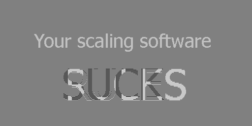
Jonas Berlin sent this image. Scale it down 1:2 with your software...:
There used to be another page on the subject at this address: www.all-in-one.ee/~dersch/gamma/gamma.html
This page by Leo Bodnar has great graphics, for example to show that in linear encoding a minimum of 12 pixels are needed: http://lbodnar.dsl.pipex.com/imaging/gamma.html
Precise defintions: www.poynton.com/notes/colour_and_gamma/GammaFAQ.html
3D application developers should specify sRGB if they are using gamma-space source textures: http.developer.nvidia.com/GPUGems3/gpugems3_ch24.html
About sRGB encoding, the explanations by Bill Spitzak: mysite.verizon.net/spitzak/conversion
Links provided by Rudolf Eyberg:
www.imagemagick.org/Usage/resize/#techniques explains quite good the options with linear transformation RGB, LAB, LUV, Gamma or sigmoidal.
In electrical engineering, the non-linear coding is very usual and very well known. It is also known as "Companding" en.wikipedia.org/wiki/Companding and is used since a very long time in telephony voice transmission en.wikipedia.org/wiki/A-law_algorithm en.wikipedia.org/wiki/G.711
Comments on
 : tech.slashdot.org/story/10/02/23/2317259/Scaling-Algorithm-Bug-In-Gimp-Photoshop-Others
(many thanks to Wescotte)
: tech.slashdot.org/story/10/02/23/2317259/Scaling-Algorithm-Bug-In-Gimp-Photoshop-Others
(many thanks to Wescotte)This page was also reported on www.reddit.com
All product names mentioned are registered trademarks of their respective owners.
The computer scripts I wrote for this page are under GNU GPLv3 license.
Eric Brasseur - August 30 2007
till May 22 2018
